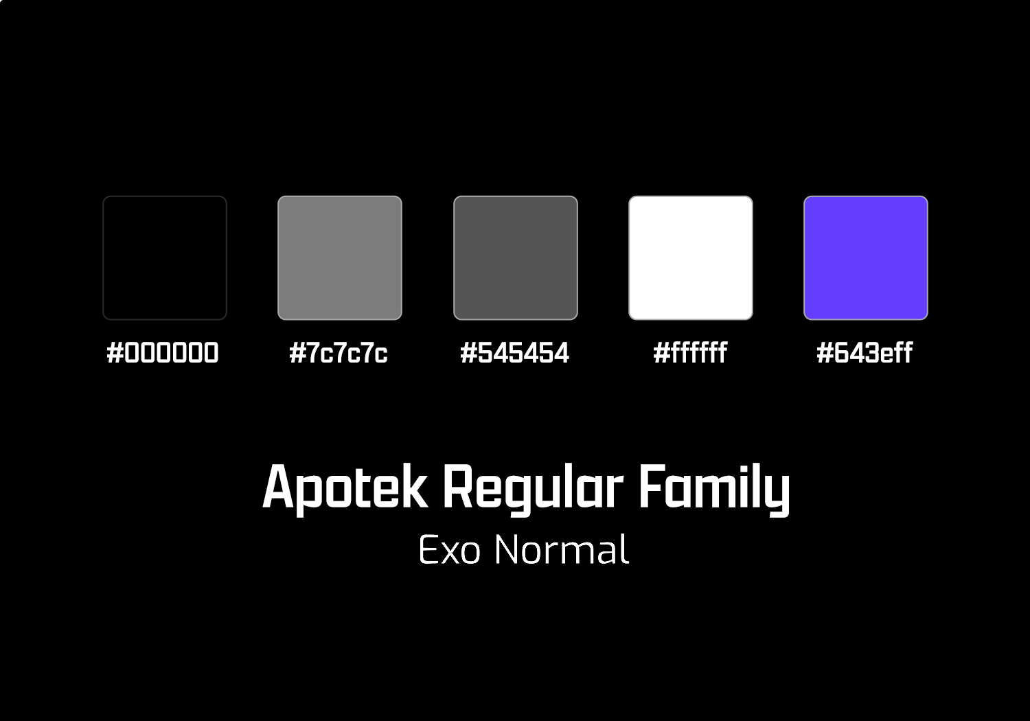


My logo blends modern polish with personal meaning, inspired by the typeface Apotek’s athletic feel. The three stars are a nod to my Tennessee roots. Swashes add elegance, while a black-and-white color scheme reflects my rugged, determined, and thorough process. A bold, regal purple is used as an accent, conveying my insistence on professionalism and polished work.
